Creating a cohesive color scheme in your home is crucial for achieving a harmonious and visually appealing space! Whether you prefer an eclectic mix of colors or more of a monochromatic look, thoughtful consideration of your color choices is key to ensure they complement each other well.
Here are some tips to help you create a cohesive color scheme in your home:
- Consider the Mood: Think about the atmosphere you want to create in each room of your home. Cool colors like blue and green help create a calming and serene environment while warm colors such as red, orange, and yellow can create a cozy and inviting feel. You should also consider your existing furniture, flooring, and other elements in your home before choosing a color scheme. Make sure your new colors complement these existing elements and match the mood you aim to create.
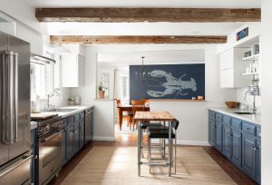
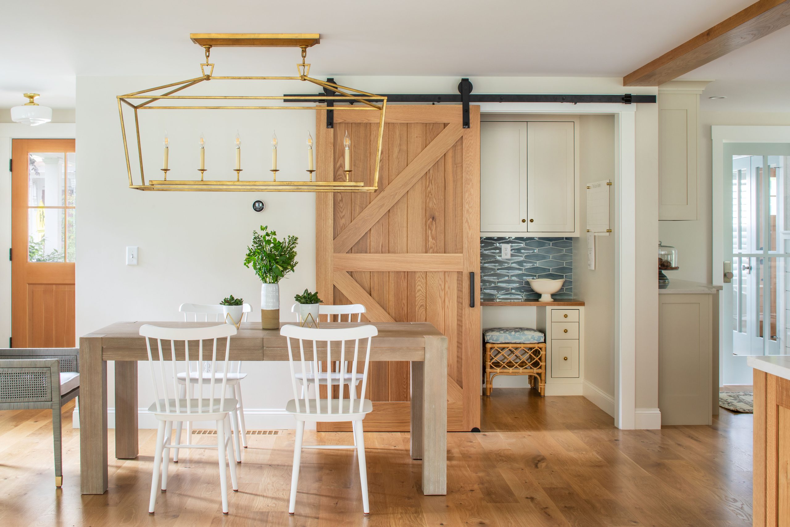
- Choose a Base Color: Start by choosing a primary color that will serve as the anchor for your design. This color will set the tone for the rest of your space and can be used in pieces of furniture, walls, or accessories. This could be a neutral color or a bolder color such as navy blue or violet. Neutrals such as white, beige, and gray tones can help balance out bolder colors and provide a sense of calmness and sophistication. Try using neutrals as a backdrop for your chosen colors or as accents to tie everything together. One of our favorite neutral colors is ‘Simply White’ by Benjamin Moore!
- Use a Color Wheel: Use a color wheel to help you choose complementary colors that work well together. Select one or two additional colors to complement the primary color and use them consistently throughout your space to add more interest and depth. Analogous colors (colors that are next to each other on the color wheel) or complementary colors (colors that are opposite each other on the color wheel) can help create consistency and that cohesive look you aim to achieve.
- Use Different Shades and Tones: Incorporate different shades and tones of the colors you selected to help prevent your space from looking too flat. It is also important to consider the undertones of the colors you choose. Warm undertones create a cozy atmosphere, while cool undertones have a calming effect. Ensure that the undertones of your colors are consistent throughout the space.
- Accent Colors and Lighting: Use accent colors sparingly to add pops of color through throw pillows, artwork, rugs, or other decor. Try following the 60-30-10 rule. This means that 60 percent of your space is the dominant color, 30 percent is the secondary color, and 10 percent is the accent color. You should also keep in mind how natural and artificial lighting can affect the way colors appear in your home. Test out paint samples and fabrics in different lighting conditions to ensure your color scheme looks cohesive throughout the day and night.
By following these tips and carefully selecting your colors, you can create a visually appealing color scheme in your home that reflects your personal style and creates a welcoming and harmonious environment for you and your guests to enjoy. Since there are many paint and color options to choose from, you may need help getting started. Consider booking a free consultation with Amy here to help you choose the right color scheme for your place!

