Do you love color and want to infuse it into your home without it being too overwhelming? Adding color to your space can completely transform the atmosphere and make it feel more vibrant and alive. The challenge is finding the perfect balance that works with your personal style and the overall feel of your home.
With the right approach, you can create a space that feels inviting, energizing, and uniquely yours. Here are some ways to approach color that will not only enhance the beauty of your home but also maintain a sense of balance.
EXTERIORS
In today’s design landscape, there is no doubt that neutral colored houses are very trending right now. However, stepping outside the trend and embracing a more colorful exterior can be a refreshing change. The easiest way to add color to your exterior is to start by focusing on the siding and trim.
If you naturally gravitate towards neutral shades, there’s no need to force yourself into a bold palette. However, if you find yourself intrigued by color yet uncertain about your choices, let’s do some exploring.

- Observe Your Neighborhood: Before settling on a hue, take some time to stroll around your neighborhood. Pay attention to how homes complement one another. A row of matching green houses might feel monotonous, and instead, it can be exciting to choose a color that harmonizes with your neighbors while still showcasing your own style.
- Choose Your Siding Material: The selection of siding materials plays a crucial role in your color choices. For fabricated products, you’ll often be limited to classic shades like neutrals, red, blue, and green. While those options may seem basic, this simplicity can actually streamline the decision-making process.
- Consider Painting: If you’re painting existing siding, now is the time to unleash your creativity! While it’s advisable to stick with reds, blues, or greens, remember that most paint manufacturers offer carefully curated colors specifically designed for exteriors, ensuring both durability and aesthetic appeal.
- Google is Your Friend: If you are leaning towards a specific color but are unsure how it would look on your house, look for homes that are already painted in that shade. This can give you a good visual reference that may solidify your decision.
- Connect with Local Resources: Your local lumber or paint store are great resources to go to if you need help. Ask if they know any homes in the area that showcase the siding you are considering. If so, a quick drive-by could spark further inspiration!

INTERIORS
When it comes to adding color indoors, your options can range from a single vibrant throw pillow to a room enveloped in bold hues. If you’re contemplating a fully colored room, one essential consideration is color intensity. This concept pertains to how much black or white exists within a color–essentially dictating its richness.
When selecting colors, utilizing a color fan deck can be an invaluable tool. Aim to choose shades that align in intensity, whether you want to go from light to dark.
Here are some of my favorite sources of interior design inspiration:
- Cabinetry: Modern Steel Farmhouse
- Tile: Zia Tile
- Paint: A Guide to Choosing the Right Paint Finish for Your Home
- Wallpaper: Historic Home Upgrade
- Lighting: The Chartreuse Bonnet Pendant by deVOL
Accessories: Don’t shy away from fabrics, wallpaper, tile, and accessories that inspire you. Whether you choose to match or contrast them with existing elements, these choices will set the tone for your space. For instance, envision the moody yet sophisticated essence of deVOL’s The Pink & Blue Room, Bath. The carefully chosen collection of blue, white, cream and pink plates from antique fairs that are strategically hung on the wall really complement the overall design.
Paint: For those grappling with color choices, Samplize is a great resource to help you get close to the right color. Their large peel-and-stick samples allow you to explore how different colors interact with your room throughout the day, as light shifts and alters perceptions.
Project Highlight: New Englander Expansion
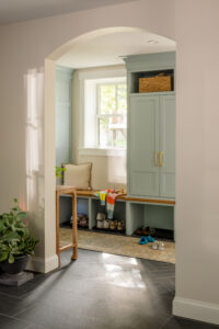
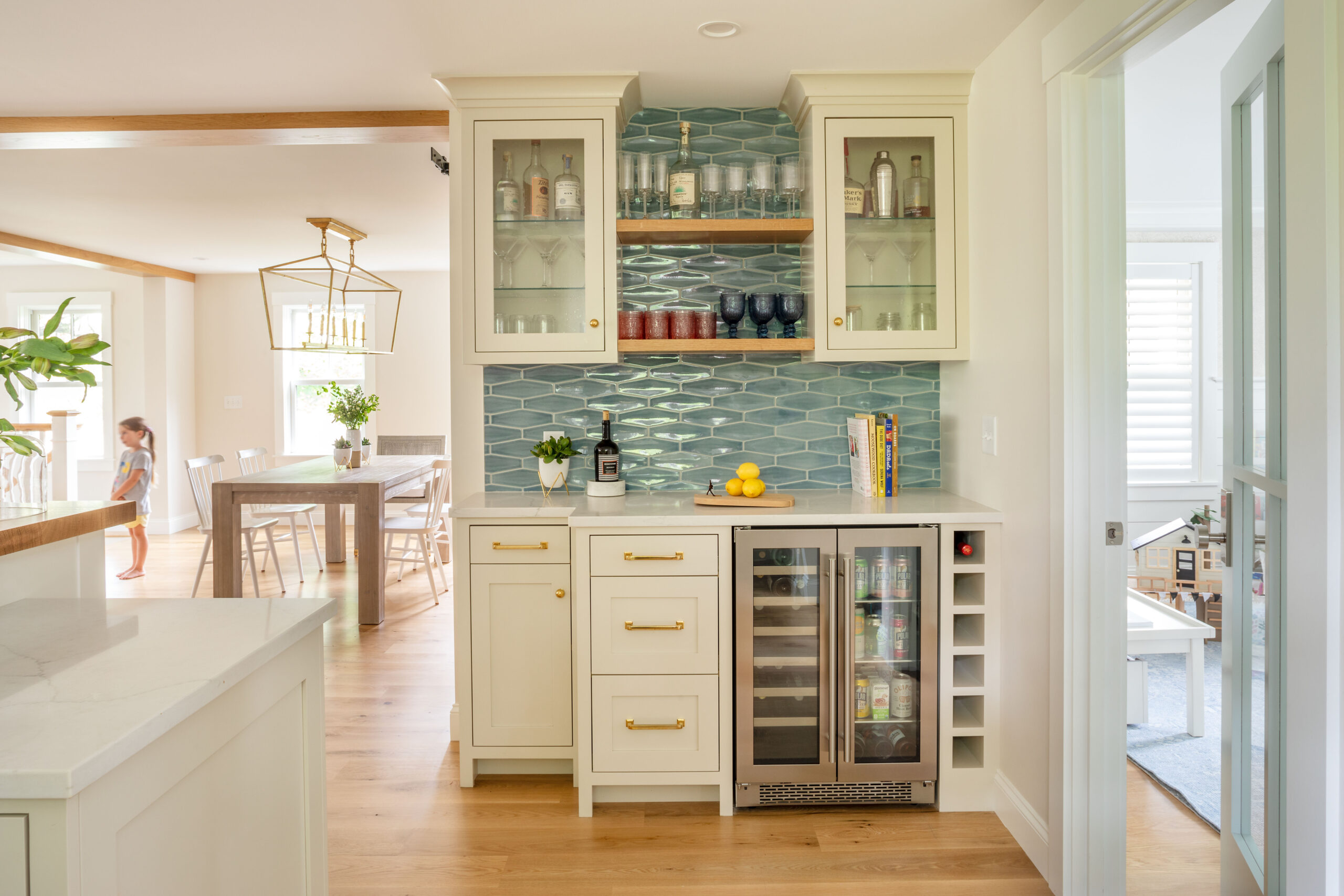
Introducing the New Englander Expansion! Nestled in the Historic District of Portsmouth, NH, this charming 4-bedroom, 3.5-bath home features a spacious first floor with a beautifully open kitchen, living, and dining area that seamlessly extends to a functional deck. To add a splash of color, we selected ‘Parma Gray’ by Farrow & Ball for the mudroom cabinetry, offering a soft, welcoming touch to the home’s entrance.
This choice harmonizes perfectly with the ‘Stellar Trestle Wedgewood’ tile by Sonoma Tilemakers, used as the backsplash in the kitchen, bar, and pantry. The tile’s subtle blue hue enhances the overall color scheme, creating a cohesive flow that adds just the right amount of color to elevate the space without overwhelming it.

By taking these thoughtful steps, you can successfully integrate color into your home while maintaining balance and beauty, while also reflecting your personal style. If you would like further help choosing the right colors for your home, consider booking a free consultation with us today!