Are you looking for a terrific tile? Well, it turns out that we are too. We are always searching for that perfect tile, so I thought I would share our process on how we land at final tile decisions.
APPLICATION
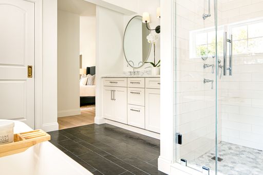
The application of tile is very important in the decision-making process. The kitchen backsplash, back of shower niche, primary bath shower walls, and floors are a few of my favorite places to add accent special tiles and subsequently spend more money on.
Be sure that all your other materials work together with color, texture, and scale when selecting tile in these areas. In other words, let the eye rest and focus on one or two things in a space, too much for the eye is simply too much and completely overwhelming.
RESOURCES
The average consumer has two ways of purchasing tile, online and retail stores. Designers can buy from trade resources which I would describe as fabulous and expensive therefore should be used for those special applications.
Retail Stores:
You can use blogs and Pinterest to narrow down your design aesthetic and goals before walking into a tile retail store. The purchasing process can be confusing so the clearer you are on the direction the better. Retail stores will let you borrow samples and should have helpful and knowledgeable sales staff but remember, we are all human and mistakes do happen. Be sure to keep your list of tiles that you are purchasing with photos and read the order carefully before purchasing.
Online Retailers:
There are amazing online tile sources at your fingertips. The best thing to do is narrow down the style that you like then find the retailer that meets your needs. For specialty tiles, take a look at Zia Tile, Cle Tile, and Mosaic House for some inspiration. If you are looking for a broad range of tiles, check out Bedrosians and Tile Bar because they sell many different styles in wide price ranges.
COLOR
We have primarily been working with white and Carrara tiles for the last four years. But color and pattern are coming back so feel free to be brave and introduce color to your palette. Classic white and Carrara are not going anywhere and I understand the hesitancy to invest in something that you fear is “trending.” But our philosophy is that if you love it, who cares if it’s trending or not.
Introducing color as an accent is one approach. The other is to have the entire space be filled with colors that all work together. For example, the powder room is an excellent place to have fun and has colored tile and wallpaper that dance gracefully together.
TEXTURE
Tile is an excellent opportunity to add texture to your space. The texture is important to stop the eye and hand and break up the simple flat surface. Textured tile can be on the wall or floor or simply make a pattern in any tiled space. Grout too can act as this texture with wider grout lines and in the opposite hue of the tile.
SCALE
Setting the mood with tile can be a powerful tool. Consider 24” x. 24” floor tiles installed in af you are leaning toward the modern vibe. Or if you have a small space, a mosaic on the floor can be a great solution to make the room feel larger.
Larger 12” x 24” tiles in the shower make cleaning easier and the space feel larger. To set this pattern, start with where you want your shower niche and make sure that the tile pattern falls with the niche then use a smaller scale tile at the back of the niche.
COST
We are not a fan of spending a lot of money where your feet (think dirty boots) will go. A good-quality porcelain tile can be beautiful, functional, and cost-effective. As mentioned above, choose one or space in your home where you want to invest in a more expensive, special tile then the rest of the home can be good quality tile like Daltile.
A quick story of what not to do:
Remember that tile installation costs are a fixed labor expense regardless of what you spend on your tile. Going cheap on the tile will only disappoint you for many years to come.
We recently had a client who spent a lot of money in her kitchen on custom cabinetry, quartz countertops and sub-zero | wolf appliances then went to Lowes and purchased an inexpensive printed 7×7 tile for her backsplash. Several things were wrong with this decision:
- Size: From the counter to the underside of the upper cabinet is typically 18” and unless specified differently, that’s what the cabinetmaker will assume. Since 7 + 7 = 14 we were off with our pattern and it looked odd, especially behind the cooktop which is 30” by code between the cooktop surface to the underside of the hood.
- Beautiful floating White Oak 2” thick shelves were being hung in the space. The conversation went back and forth for weeks to determine if the shelves or tile would be installed first. Tile won and went first but then we had to install the shelves 14” from the countertop up every 14”. It looks beyond odd!
- Quality: Inexpensive printed tiles not only look terrible and cheaply screen printed but the dye or color lots are not consistent. This particular pattern was beige and white and the beige went from pink to brown. The installer spent a good amount of time laying out the pattern trying to mix in the different color hues to try to blend them.
- Cost: Now, time is money so exactly how much money do you think she saved by going to Lowes and buying inexpensive tile? And do you think that tile is going to get switched out anytime soon? We guarantee NO.
Terrific tile is one of our favorite things to research and find. Just keep in mind the application, color, texture, scale, and cost and you can’t make a mistake. Embrace and love your tile then move forward with enjoying the space.


