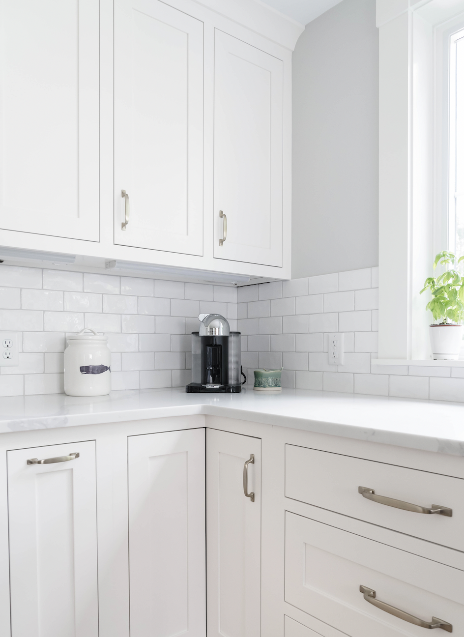
Are you getting ready to paint? If so, the first thing you are considering is the color, and I have some color selection tips & tricks for you, so here we go…
- QUALITY PAINT. Always, always use a quality paint brand. I know that there is less expensive paint out there, but when you calculate how many coats you have to do of a cheap brand, you might as well just throw your money on the table and invest in: Benjamin Moore (BM), Farrow & Ball (F&B), C2 and Fine Paints of Europe (FPE). I don’t mind Sherwin Williams (SW) quality; I just don’t like their colors, so the painters will often have them match the colors but be sure that it is the RIGHT COLOR!!!
- PRE-SELECT COLORS. Take some time before going to the store to review colors and come up with a select list of what you think might work. I will spend a few hours gathering samples for my clients. It’s always more than you think.
- The goal in pre-selecting colors on a table is to know that all the colors you are considering work and flow together nicely. This way, regardless of your final selection, you know that the colors blend as you walk from space to space.
- TEST RUN. Paint and painters are expensive, so make sure you like the color. Typically, we are painting one color in a large area, so you want to ensure it’s a good fit. For example, in the New Englander Reno, we painted the first-floor common walls, the entire staircase up to the third floor, and the second-floor hallway one color. BM Calm, Classic Grey, Grey Owl, and SW Repose Grey were up for consideration. The winner was… BM Calm. It is a beautiful color and will sometimes be ready white and is a true grey whereas Classic Grey can read tan and the other greys were a bit too dark for the space.
- ACCENT WALLS: I’m a big fan of accent walls or “surprise walls.” These are typically walls that you can’t see until you are in the space, and they bring an element of joy to the area. For example, in the New Englander Reno, we use BM Raccoon Fur, a light black on the TV wall. I love the idea of the TV blending into the wall color.
- MOOD: There is no doubt that color creates the mood. Sometimes you want the space to feel fresh and clean, while other times, you want to feel cozy. At the New Englander Reno, their library will be painted BM Stonington Grey, a medium grey hue with Brass light fixtures, and the built-ins will be BM Hale Navy, a very dark blue creating a cozy library feel.
- ORGANIZATION: Keep an excel sheet with your final selections. This is always helpful as a working document to keep track of paint selections to have in the future for touch-ups. Keep this on a drive like Dropbox or Evernote, print a copy, and keep it by your paints.
Long and short, paint can be fun and frustrating at the same time. Remember that it’s a process to get to the right color. But once you find it, you will be thrilled to love your walls!


